New year, new you, new Slack. The popular workplace chat service’s resolution clearly involved a bit of a facelift, starting with a new logo. A redesigned version of the familiar grid logo launched this week, and appears to have rolled out on most major platforms.
Slack did the customary thing of explaining the hell out of the new design over of its blog. There’s all of the usual stuff there, about maintaining the spirit while moderning thing up a bit. The company also calls the design “simpler,” which is certainly up for debate. That’s fair enough from the standpoint of the color scheme, but try drawing this one from memory. It’s considerably tougher that the old tic-tac-toe version.
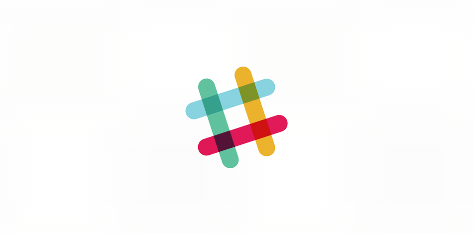
The new logo does away with the tilted hashtag/pound symbol of overlapping translucent colors in favor of a symmetrical arrangement of rounded rectangles and pins. The multiplying colors have been pared down to four (light blue, magenta, green and yellow) and the whole effect is reminiscent of a video game console or hospital.
“It uses a simpler color palette and, we believe, is more refined, but still contains the spirit of the original,” the company writes. “It’s an evolution, and one that can scale easily, and work better, in many more places.”
Created by Michael Bierut at the New York firm, Pentagram Design, the new logo marks the first major redesign since the company was launched (in fact, the original apparently predates Slack’s official launch). “The updated palette features four primary colors, more manageable than the original’s eleven, which suffered against any background color other than white,” the firm writes in its own post. “These have been optimized to look better on screen, and the identity also retains Slack’s distinctive aubergine purple as an accent color.”
The new design does potentially open up another issue:
The negative space in the new Slack logo makes it look like a whimsical swastika.
Thank you for coming to my TED talk about how the internet has ruined my brain forever. pic.twitter.com/6Mv1FiuJY4
— Eric Scott Johnson (@HeyHeyESJ) January 16, 2019
Slack.
Slack come on.
Making your logo a swastika is literally the easiest fucking thing to avoid in design.
How does no one catch this. pic.twitter.com/77MZlasDFJ
— Abomina-Sean (@Sean8UrSon) January 16, 2019
Unintentional, obviously, and the orientation of the above negative space addition is the ancient symbol that was later mirrored and coopted by the worst people, ever. As a number of designers have noted, well, these things can happen, though the association and “once you’ve seen it, you can’t unsee it” effect could eventually prove the new logo’s ultimate undoing.
